
Brand Identity
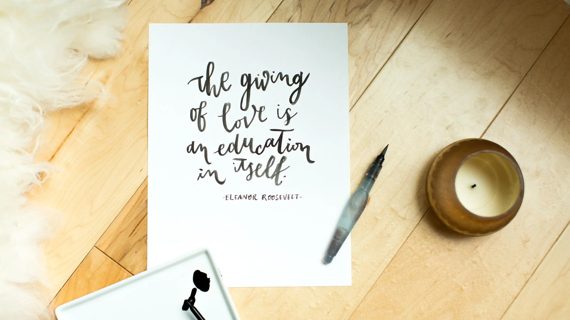
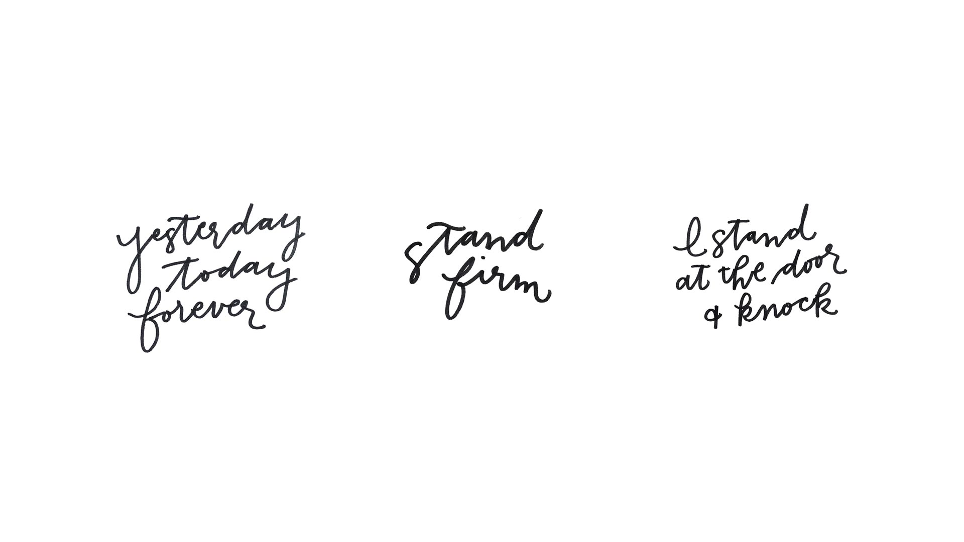
The W Conference needed an overarching brand that could flexibly iterate with each year’s distinct theme. We created a delicate & versatile monogram that could stand on its own and also integrate seamlessly into fresh aesthetics.

Visual Language
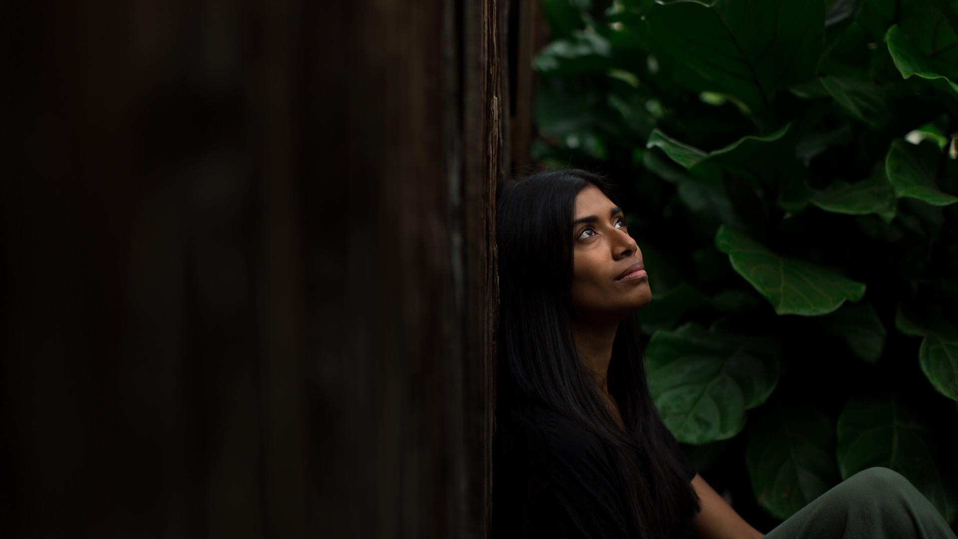
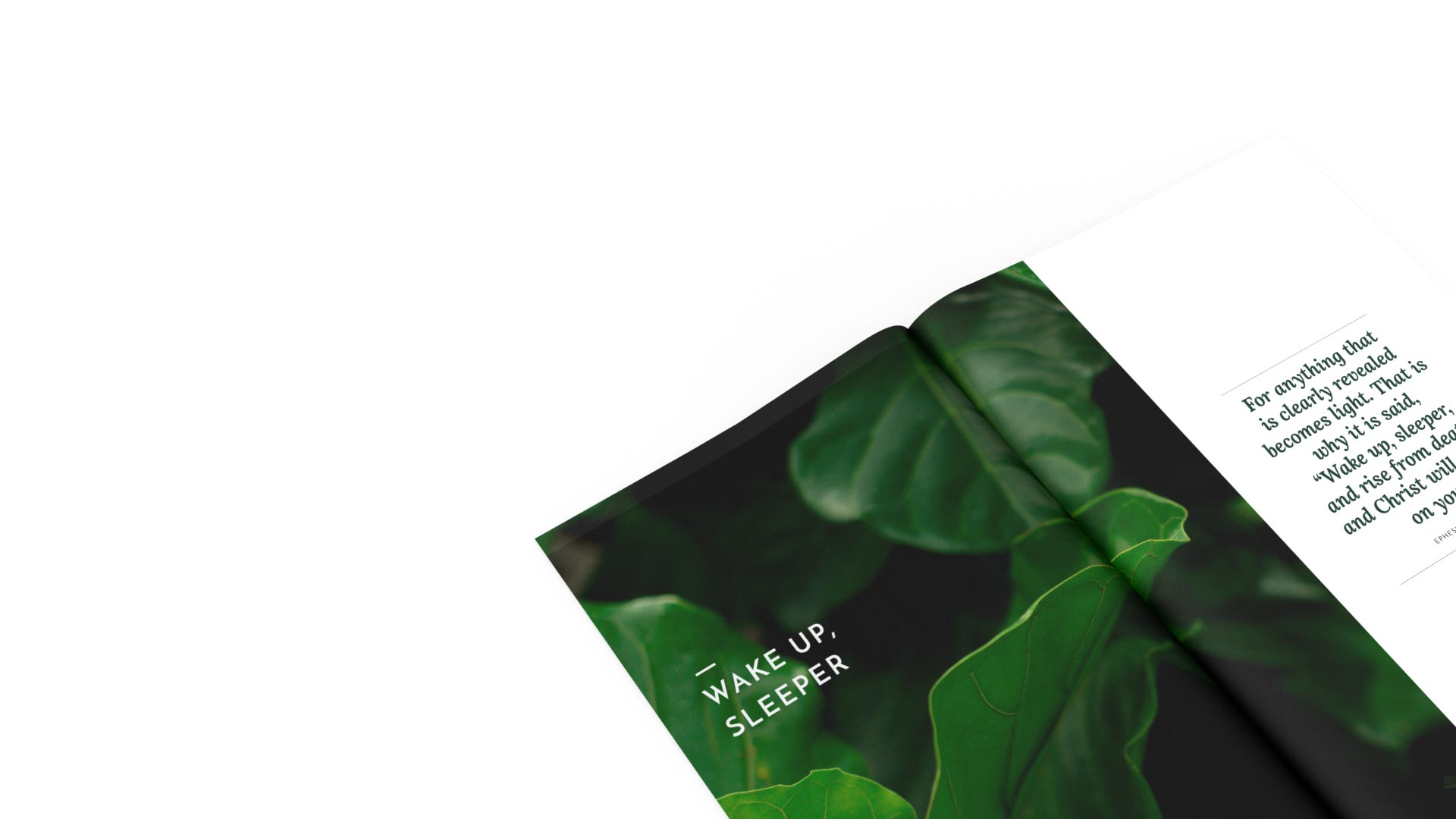
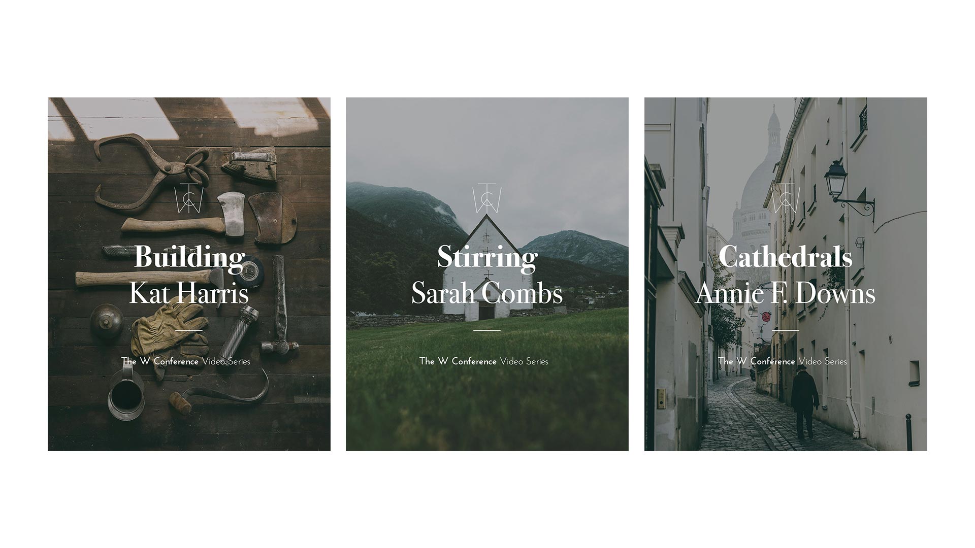
With each year, we selected an entire visual approach that would express the meaning behind the specific theme that was selected. Photographic, illustrative and all things in between were specific to the chosen theme and would evolve annually.

Photography
Each year would be an expression of femininity with an interaction with stylized objects, environments or a combination of the two to convey the overall concept.
