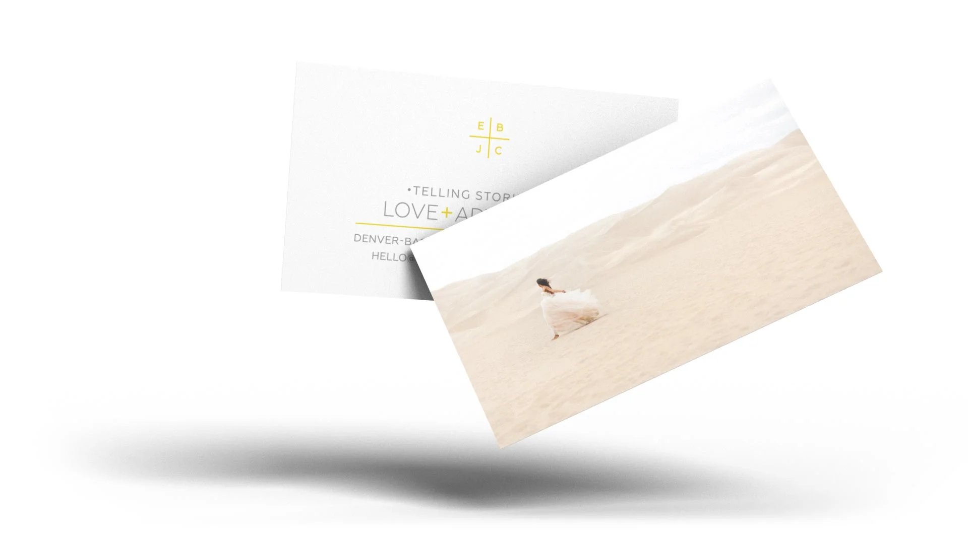
Brand Identity
EB+JC needed a brand that spoke to the elegance of the events they photograph. We developed a golden-hued brand with a typographic logo that visually expresses their name and gave it life with unified typography and clear-cut illustrations.

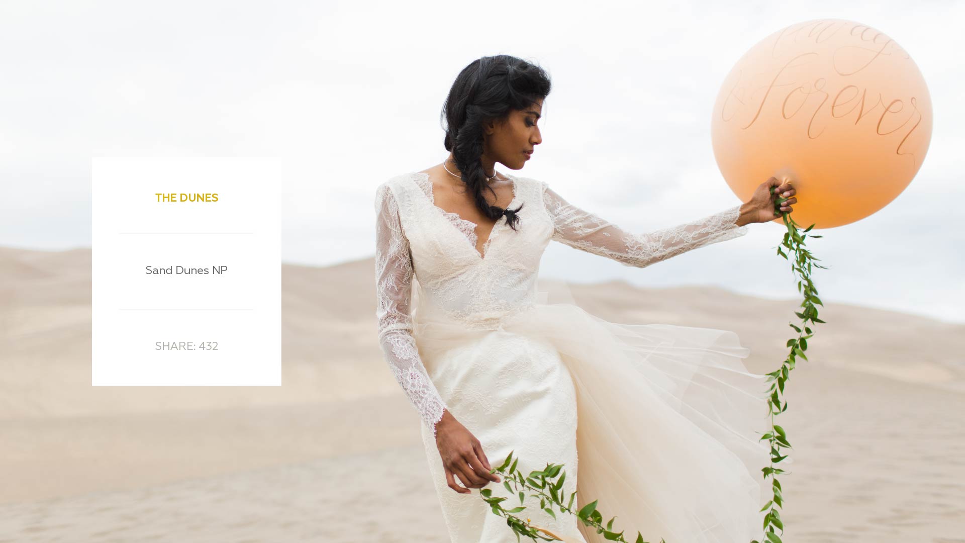
Visual Language
As a photography-forward brand, EB+JC needed graphic elements that didn’t compete or overpower the visuals. A well tailored message combined with airiness helped the communication points supplement the visuals without ever overshadowing them.